I turn complex digital products into clear, usable and visually consistent experiences — from early research and UX architecture to design systems, interfaces and launch.
6+ years / Based in Prague
6+ years / Based in Prague
Yana Dmitrieva
Senior Product designer
Senior Product designer
CASES
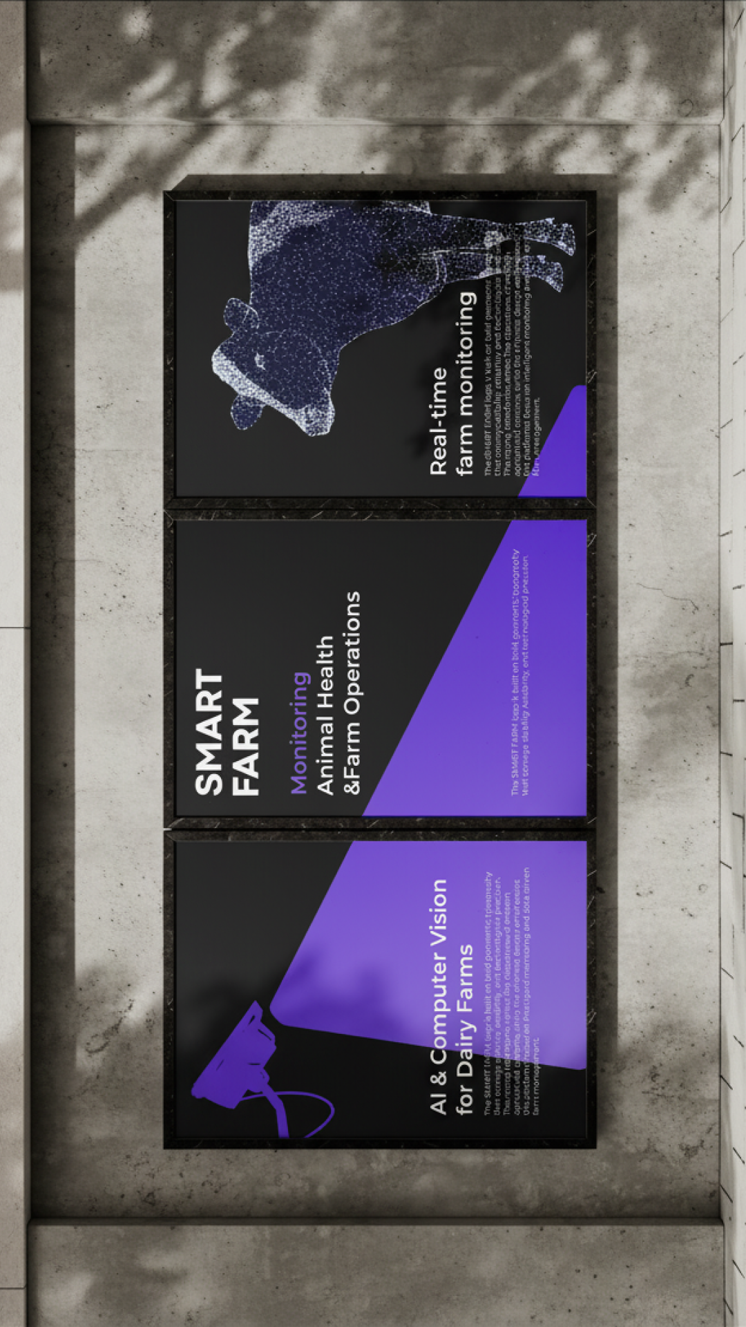
From AI detections to farm decisions:
Designing Smart Farm’s livestock monitoring platform
Designing Smart Farm’s livestock monitoring platform
0-to-1 product · Web app · Mobile app · Design system
↳ ABOUT PROJECT
CLOSE ↵
Company
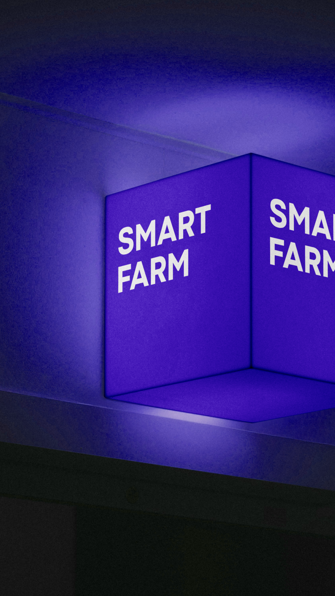
SMART FARM
Product type
B2B SaaS platform for AgriTech
Team
Product Designer (Junior Designer joined the team later),
Computer Vision Engineer, 3 Data Scientists, 2 Backend Engineers, Frontend Engineer, QA Engineer, Product Manager, Business Analyst
Computer Vision Engineer, 3 Data Scientists, 2 Backend Engineers, Frontend Engineer, QA Engineer, Product Manager, Business Analyst
Role
Product designer
Platforms
Web, iOS, Android
Context
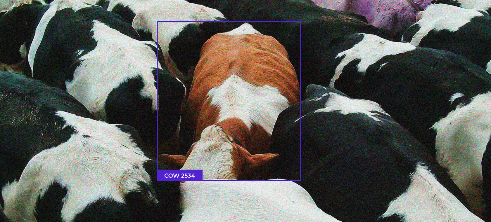
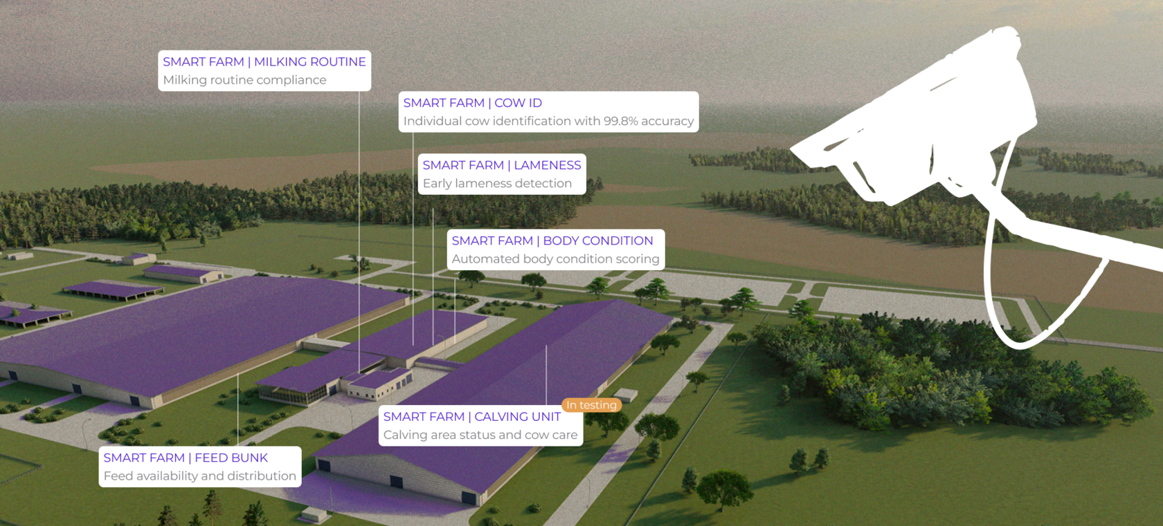
SMART FARM started with a simple product hypothesis: if cameras could be trained to recognize key situations on a dairy farm, video monitoring could become a real operational tool rather than passive surveillance.
Farm teams already rely on visual observation to notice feeding issues, health risks, and routine violations. But on large farms, these checks are manual, fragmented, and easy to miss.
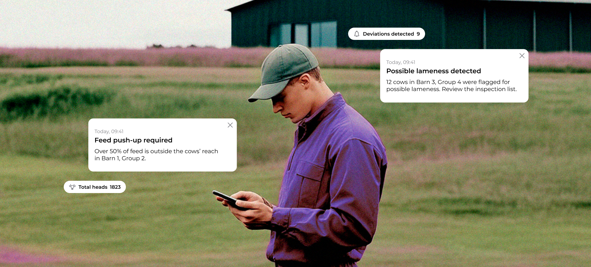
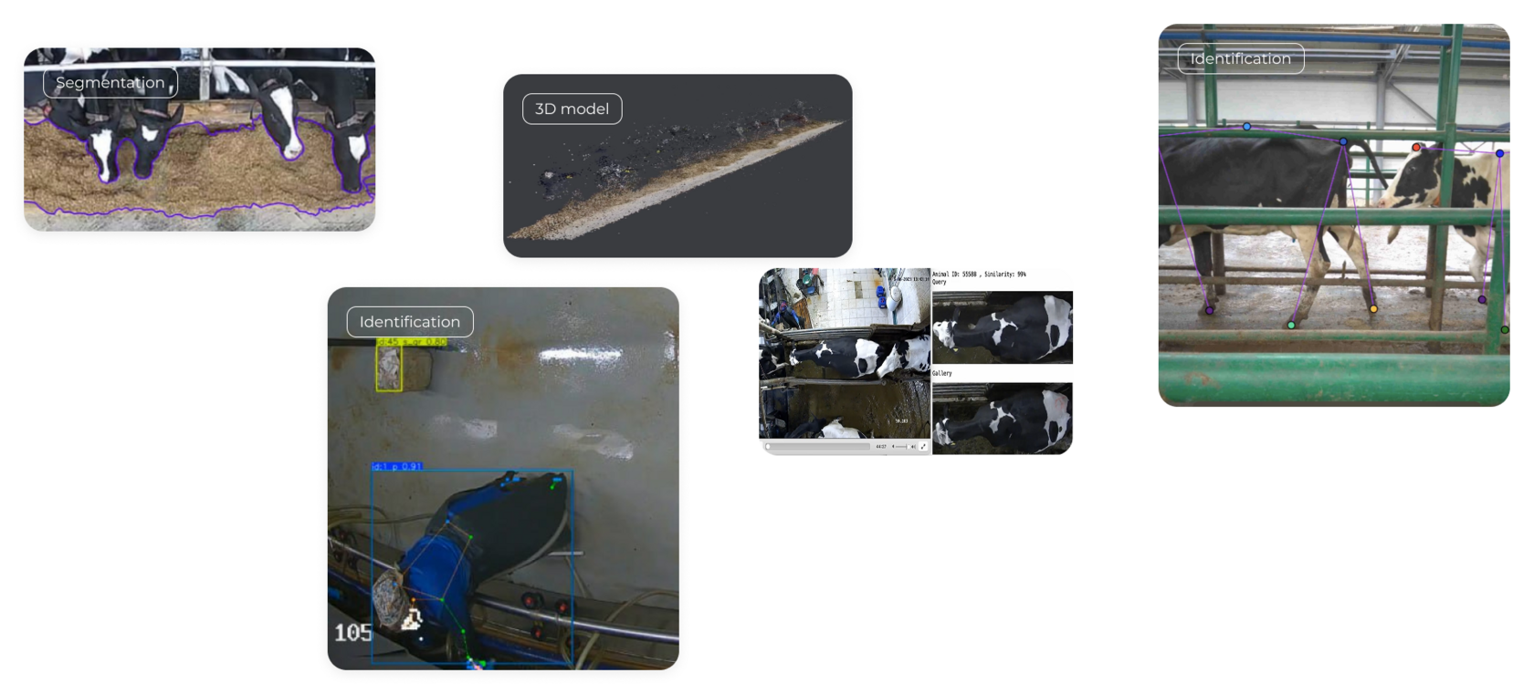
The challenge was to turn raw camera footage and AI detections into clear workflows: what happened, where it happened, which animals or groups were affected, and what action should be taken.
My role was to design the product logic and interface that made these detections understandable and useful for everyday farm operations.
Farm teams already rely on visual observation to notice feeding issues, health risks, and routine violations. But on large farms, these checks are manual, fragmented, and easy to miss.
The challenge was to turn raw camera footage and AI detections into clear workflows: what happened, where it happened, which animals or groups were affected, and what action should be taken.
My role was to design the product logic and interface that made these detections understandable and useful for everyday farm operations.
The Challenge
We were designing a new operational layer for dairy farms — a system that could turn camera footage and AI detections into decisions people could trust and act on.
The product logic had to be defined almost from scratch: what situations were worth detecting, how different farm roles interpret them, and what context they need before taking action.
A detection alone was not enough. Users needed to understand what happened, where it happened, which cow or group was affected, how serious it was, and whether the system’s conclusion could be trusted.
The interface had to make complex herd health, feeding, and milking routine data clear enough for everyday farm work.
The product logic had to be defined almost from scratch: what situations were worth detecting, how different farm roles interpret them, and what context they need before taking action.
A detection alone was not enough. Users needed to understand what happened, where it happened, which cow or group was affected, how serious it was, and whether the system’s conclusion could be trusted.
The interface had to make complex herd health, feeding, and milking routine data clear enough for everyday farm work.
Research
At this stage, the biggest unknown was not the interface itself. The bigger question was how dairy farms actually make decisions and how AI detections could fit into daily operations.
I used research to understand the farm as an operating system: who notices problems, who is responsible for reacting, what data people trust, and what context they need before taking action.
I started by analyzing existing farm management systems, monitoring tools, and agricultural BI products to understand common workflows, reporting patterns, and information architecture.
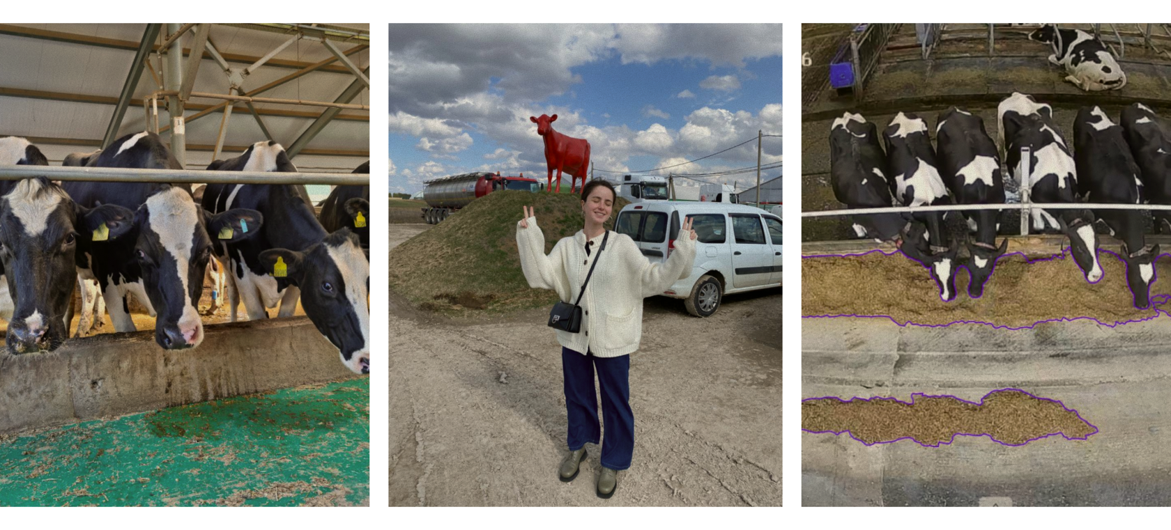
Then I conducted field research on real dairy farms (with >800 lactating cows). I observed feeding routines, animal movement, communication between roles, and how decisions were made during the day.
The goal was not to create abstract personas. It was to define the product logic: which situations should become alerts, what level of detail users need, and how the system should connect farm-level analytics with group, cow, and operational workflows.
I used research to understand the farm as an operating system: who notices problems, who is responsible for reacting, what data people trust, and what context they need before taking action.
I started by analyzing existing farm management systems, monitoring tools, and agricultural BI products to understand common workflows, reporting patterns, and information architecture.
Then I conducted field research on real dairy farms (with >800 lactating cows). I observed feeding routines, animal movement, communication between roles, and how decisions were made during the day.
The goal was not to create abstract personas. It was to define the product logic: which situations should become alerts, what level of detail users need, and how the system should connect farm-level analytics with group, cow, and operational workflows.
Research participants
- Farm owners and managers
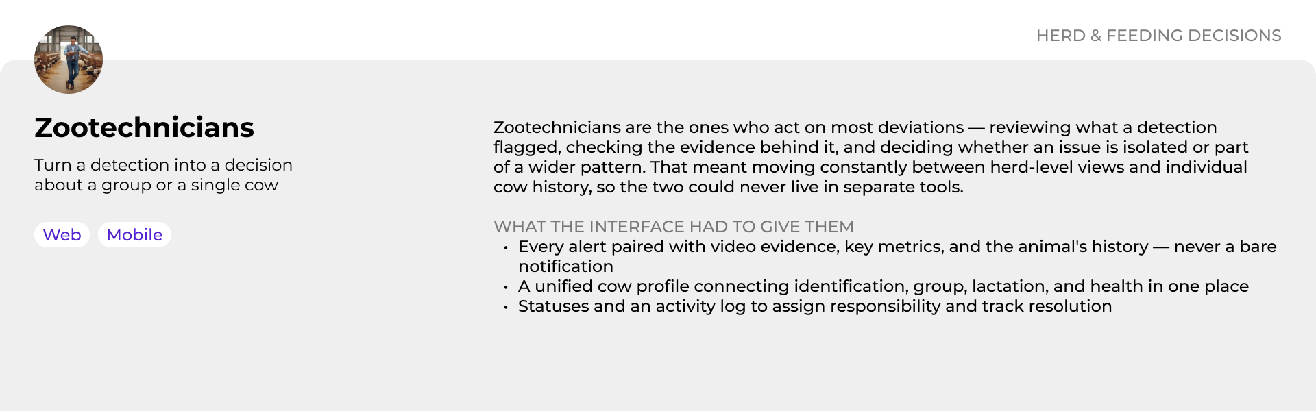
- Zootechnicians
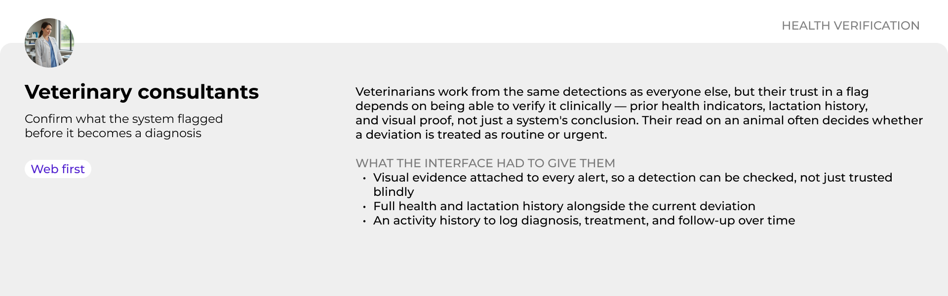
- Veterinary consultants
- Feeding consultants
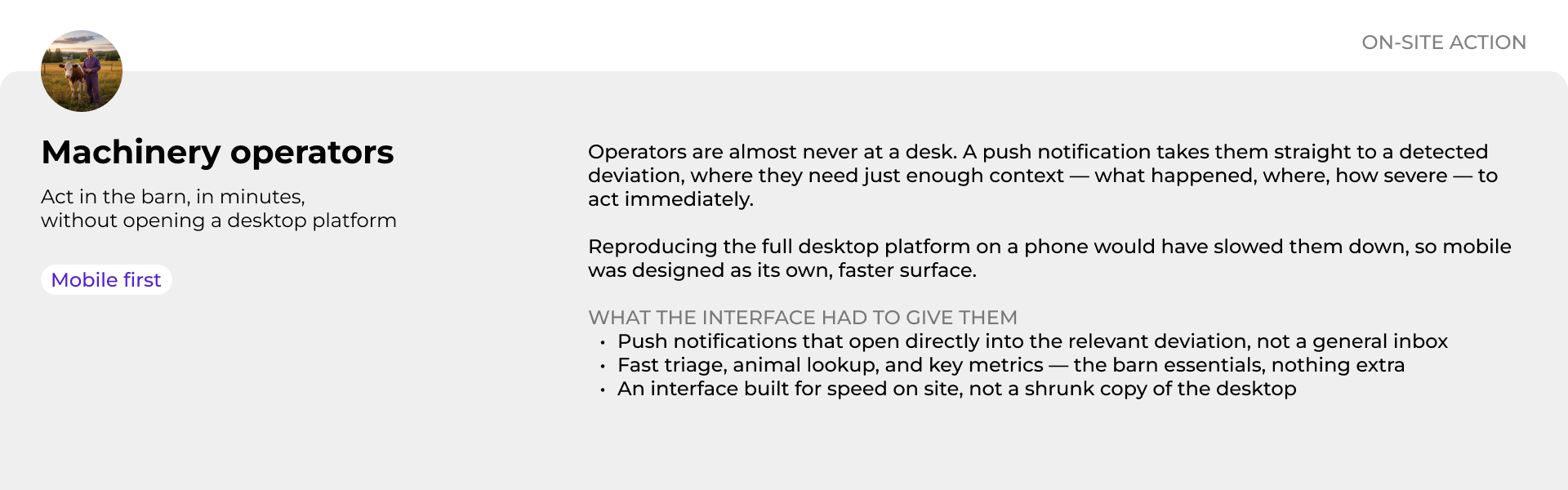
- Machinery operators
Research Activities
- Observed daily farm operations
- Followed feeding and milking routines
- Studied how different roles communicate
- Mapped decision-making around health, feeding, and routine issues
- Analyzed existing farm systems and reporting patterns
- Identified information gaps and operational bottlenecks
Key insight
Farm teams don’t need another dashboard —
they need a connected view of what is happening.
they need a connected view of what is happening.
Research showed that farm data was not simply missing — it was fragmented.
Health records, feeding data, milking results, camera footage, and operational notes often lived in separate systems or in people’s heads. This made it hard to understand whether a problem was isolated, recurring, or connected to a broader pattern.
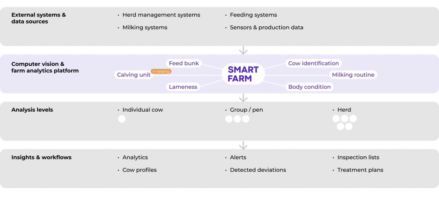
This insight shaped the product architecture. Instead of designing separate tools for each module, we built SMART FARM as a connected platform that combines external data sources, computer vision detections, historical records, and workflows across individual cow, group, and herd levels.
Health records, feeding data, milking results, camera footage, and operational notes often lived in separate systems or in people’s heads. This made it hard to understand whether a problem was isolated, recurring, or connected to a broader pattern.
This insight shaped the product architecture. Instead of designing separate tools for each module, we built SMART FARM as a connected platform that combines external data sources, computer vision detections, historical records, and workflows across individual cow, group, and herd levels.
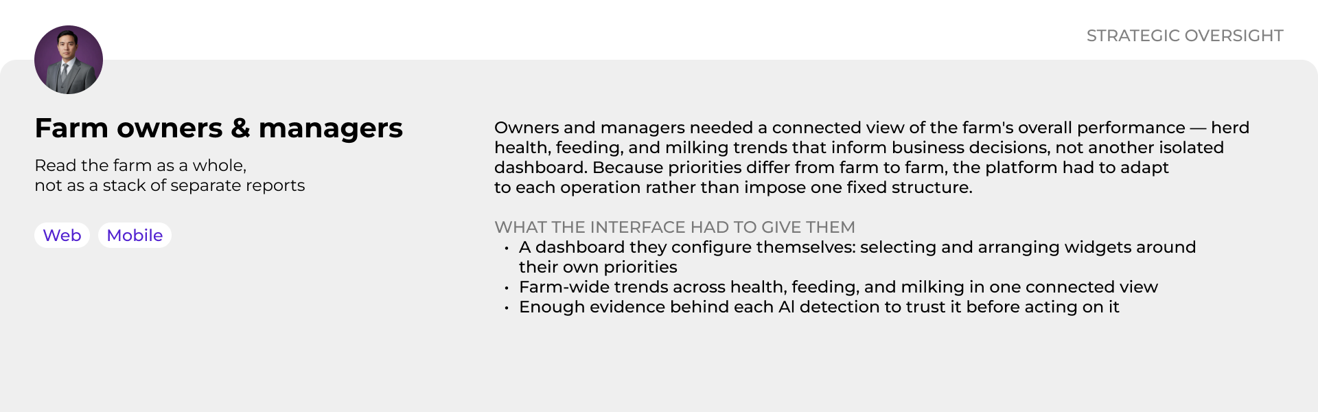
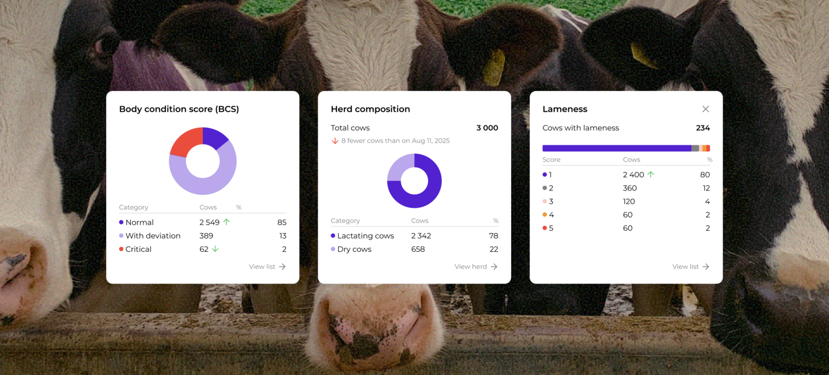
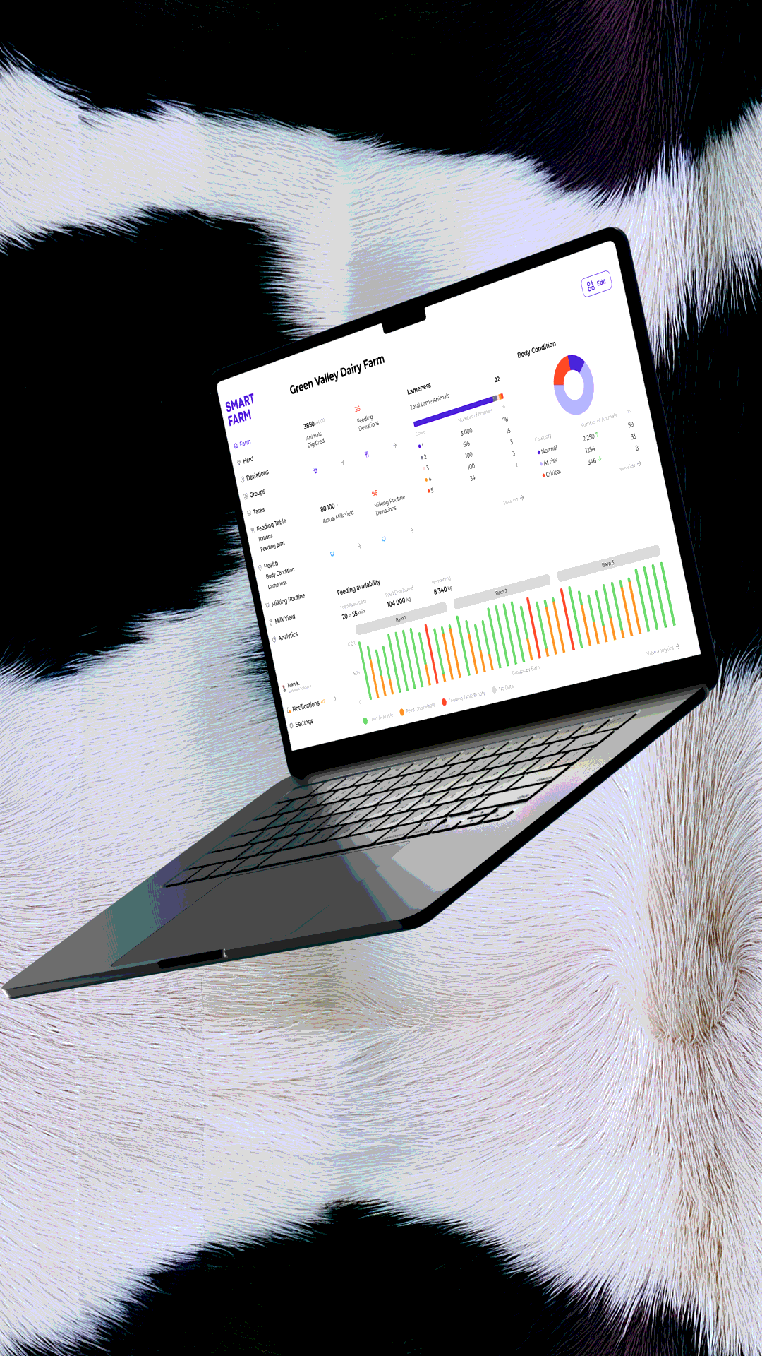
A dashboard tailored to each farm
Each farm can select and arrange widgets based on its own operational priorities.
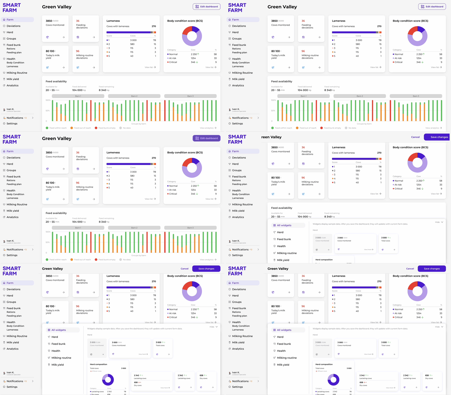
Dashboard configuration: selecting and arranging widgets
From detection to verification
Detected deviations are designed as alerts.
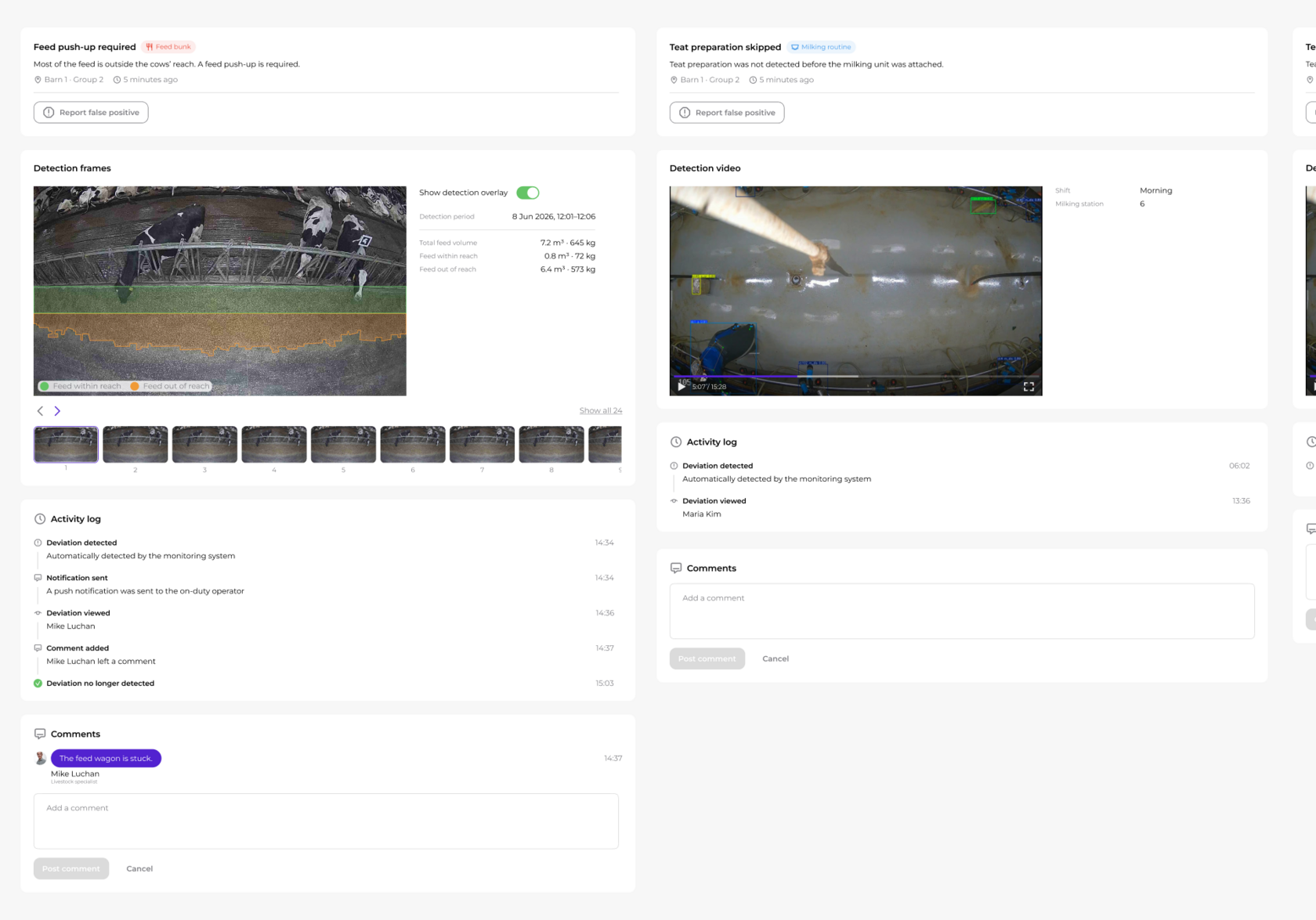
Each item gives enough context to understand the issue at a glance, while the detail view provides visual evidence, key metrics, and an activity log for follow-up.
Deviation detected → Notification sent → Review evidence → Decide what to do
Each item gives enough context to understand the issue at a glance, while the detail view provides visual evidence, key metrics, and an activity log for follow-up.
Deviation detected → Notification sent → Review evidence → Decide what to do
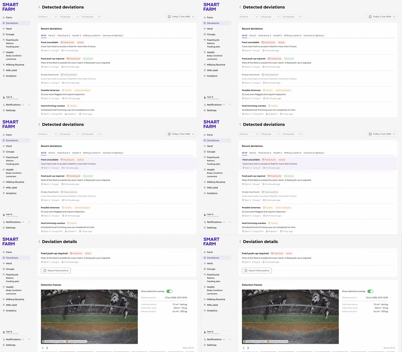
Opening a detected deviation for detailed review
From herd overview to individual cow history
Users can move from a structured herd list or group to a unified profile for any cow. Identification, group, lactation, milk production, health indicators, and transfer history are brought together in one place, reducing the need to switch between separate farm systems.
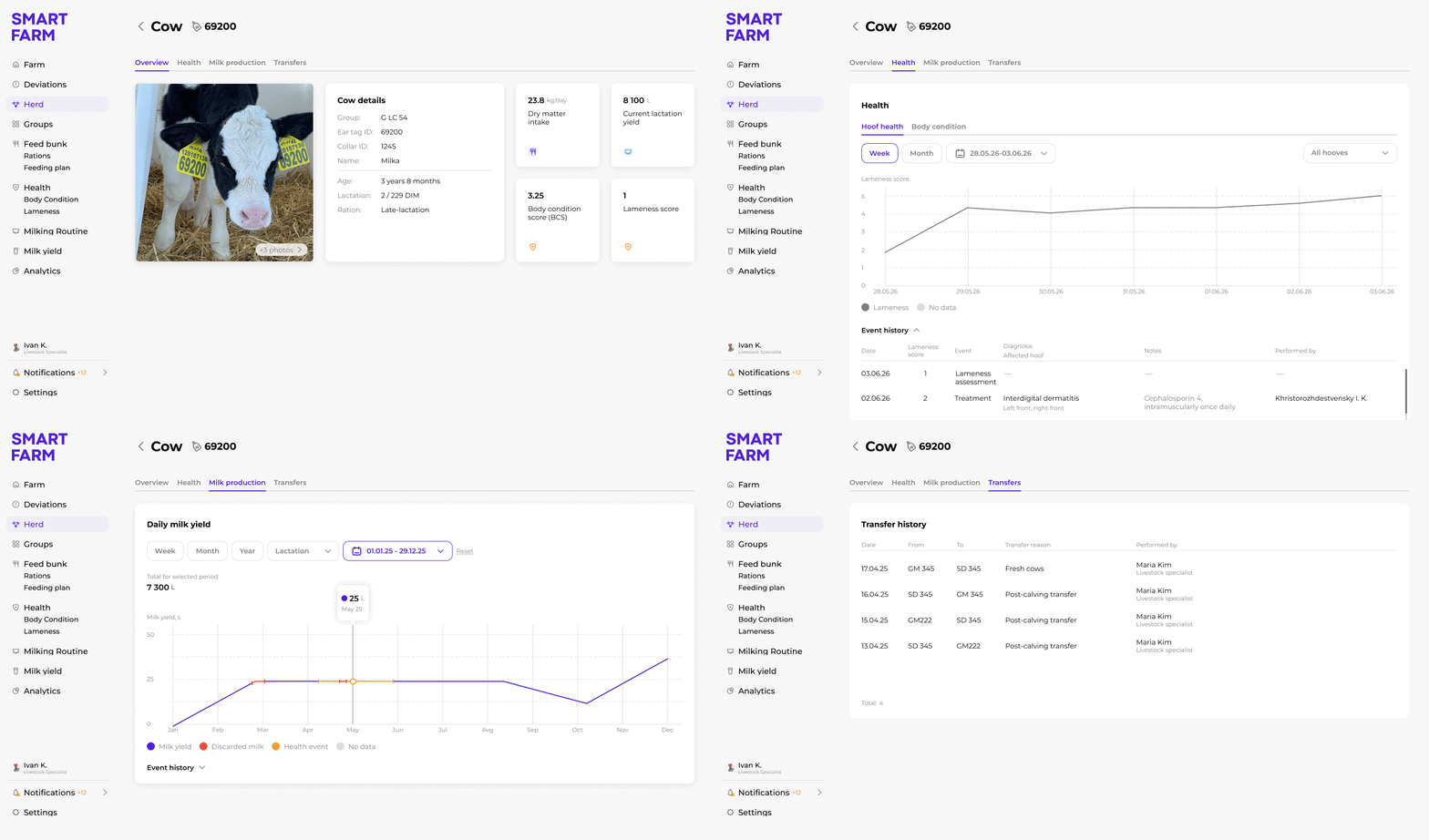
Navigating an individual cow profile
25+ workflows
The platform supports more than 25 operational workflows — from animal identification and health inspections to feeding management, analytics, and access control.
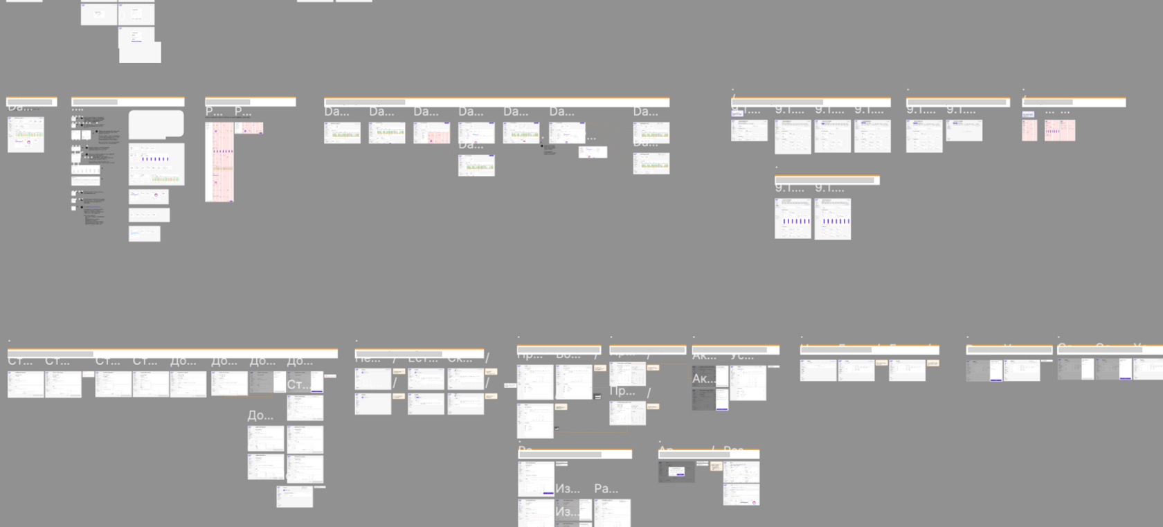
A small selection of the product’s workflows
Farm operations on the go
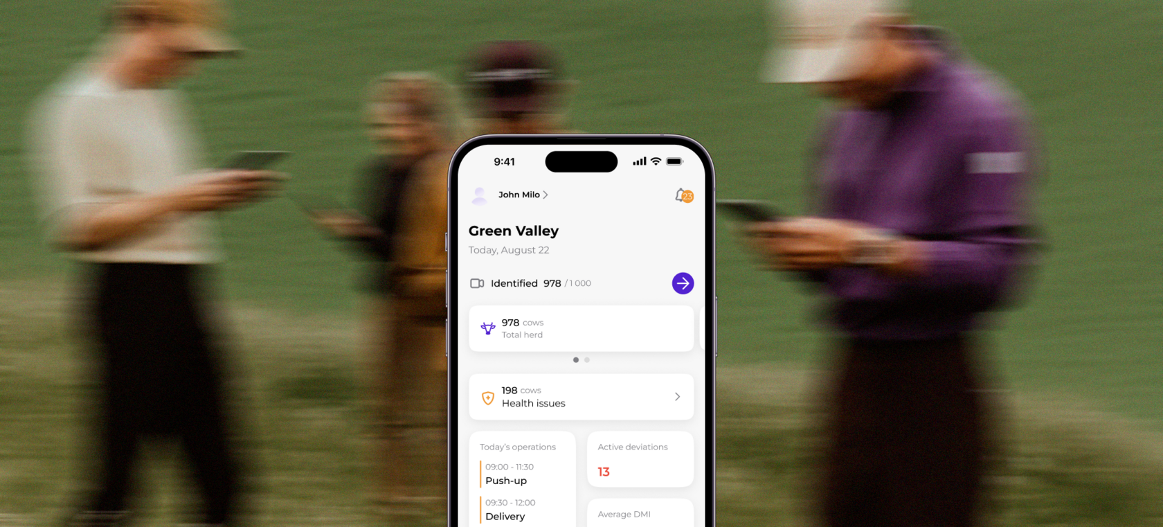
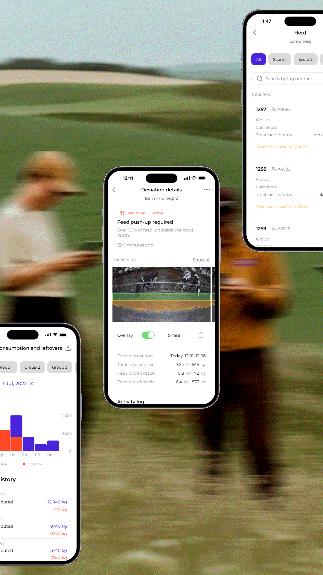
Most farm work happens away from a desk. The mobile experience gives on-site teams quick access to the farm overview, current deviations, key metrics, and individual animal data.
Rather than reproducing the entire desktop platform, the mobile interface prioritizes the information users need while working in the barn.
Rather than reproducing the entire desktop platform, the mobile interface prioritizes the information users need while working in the barn.
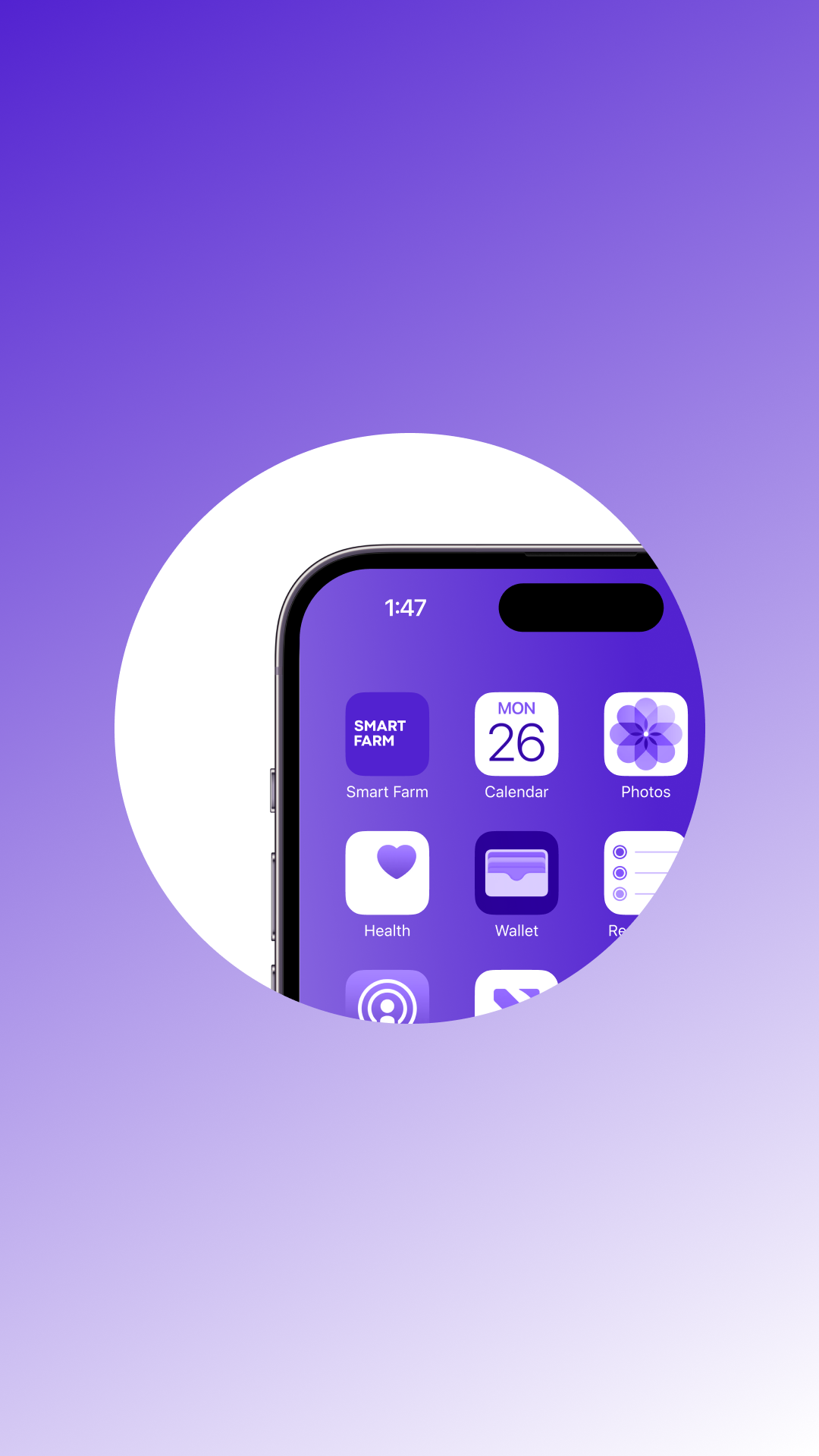
App icon

A push notification takes the on-duty operator directly to the detected deviation
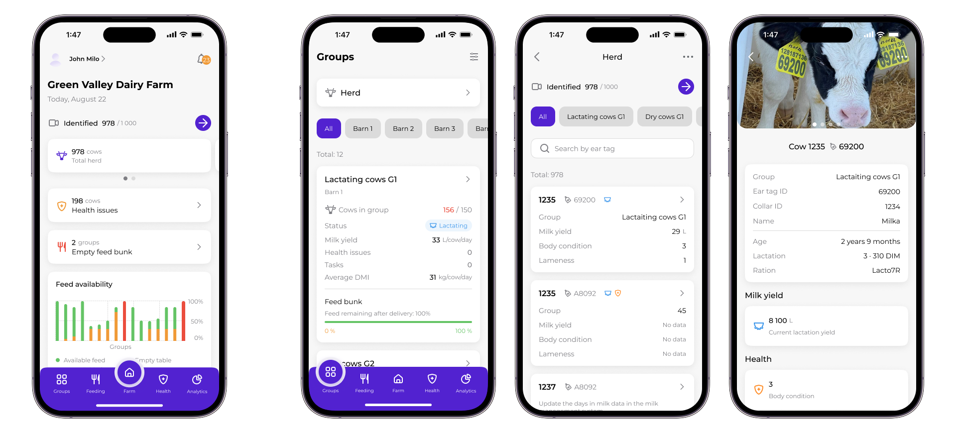
From farm overview to an individual cow profile
Design system
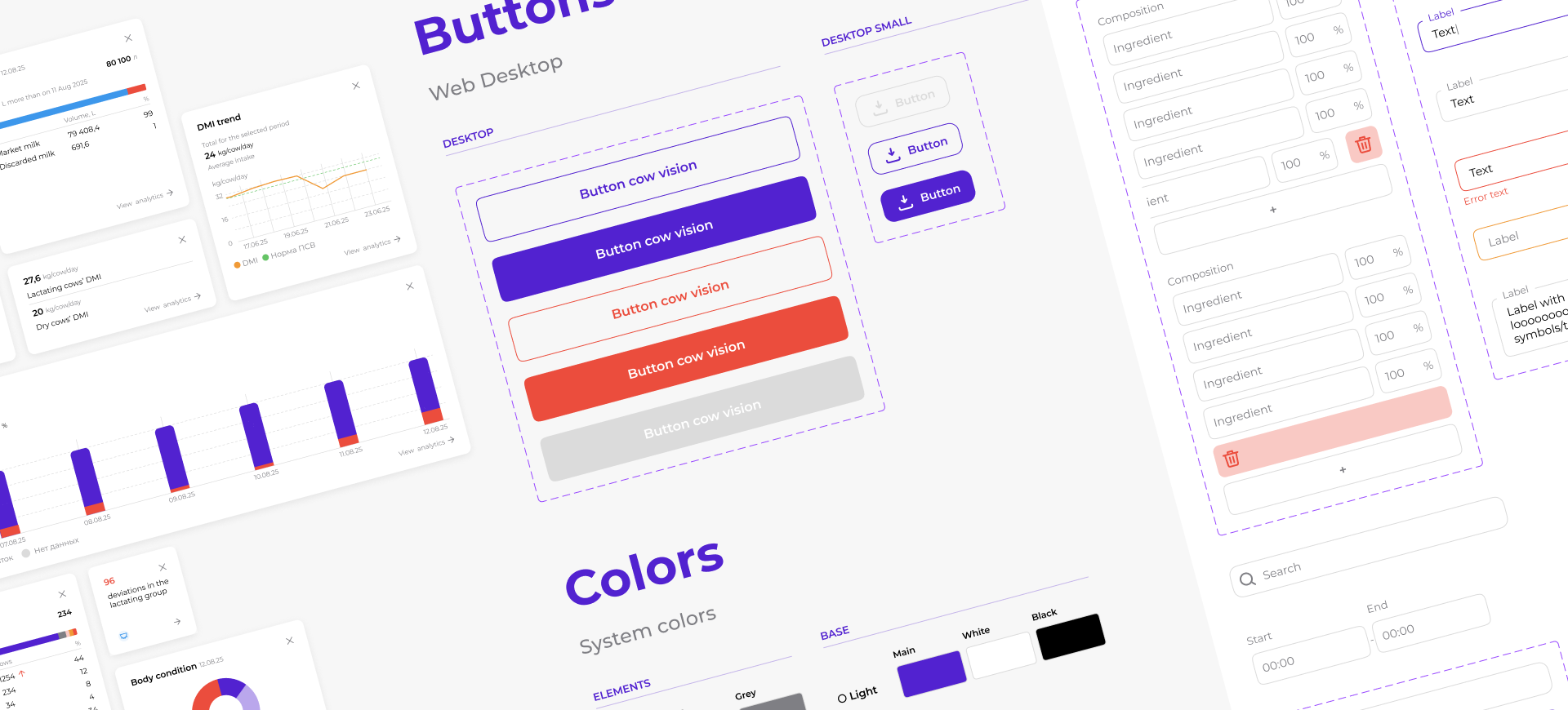
The design system started with the very first module, not as a separate initiative. Every new module added only the components and patterns it genuinely needed, so the system grew alongside the product rather than being built upfront and imposed on it.
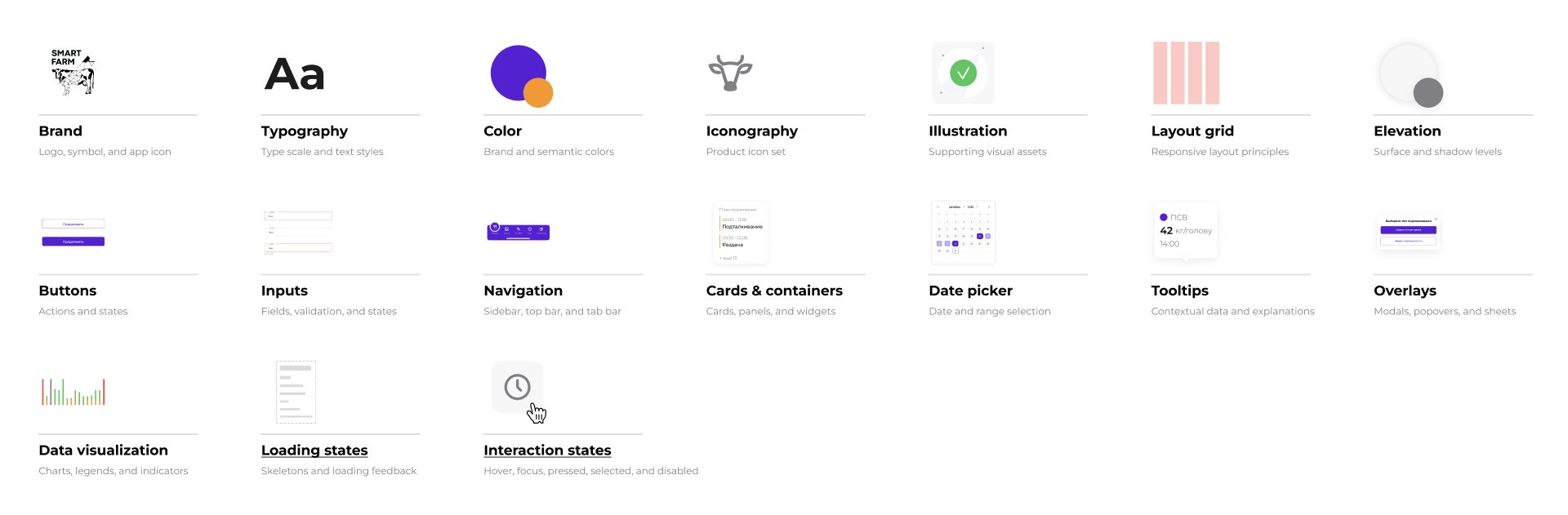
Design system overview: foundations, components, and product patterns
Impact
0 → 1 product
Designed the product from concept to a working platform.
4 user roles, 1 connected system
Farm owners/managers, zootechnicians, veterinarians, and machinery operators — each with different workflows, running on one shared source of farm data instead of four separate tools.
5 modules launched, 25+ workflows
Core modules launched, with the sixth in testing — supporting 25+ operational workflows without rebuilding the product's foundation.
30% fewer health deviations
Early detection through the platform reduced the number of sick cows requiring treatment by 30%, compared to the same period without the system — calculated by the business analyst from farm data.
10% fewer feed leftovers
Improved feeding efficiency and reduced resource waste.
25+ farms deployed
Installed and operating across more than 25 dairy farms.
All pilot customers continued after the trial
All pilot farms continued using the system after the trial and purchased at least one additional module, demonstrating trust in the platform.
“This isn’t just software —
it’s like having an extra specialist watching the barn 24/7.”
Farm owner feedback
it’s like having an extra specialist watching the barn 24/7.”
Farm owner feedback
From purchase to first connection:
Designing Dingo’s eSIM activation journey
Designing Dingo’s eSIM activation journey
Mobile app redesign · eSIM integration · International calling
↳ ABOUT PROJECT
CLOSE ↵
Company
Dingo
Product type
B2C travel connectivity product
Team
Product Manager, Business Analyst, Backend Engineer, Frontend Engineer and Product Designer
Role
Product designer
Platforms
iOS
Context
Dingo started as an international calling app and was expanding into a broader travel connectivity product with eSIM.
This created a new journey that did not end at purchase. To receive value, users still had to choose the right plan, understand device compatibility, install the eSIM, configure their phone, and confirm that the connection was ready to use.
My role was to redesign the product structure and create a clear path from choosing a plan to the first successful connection, while keeping international calling accessible within the same app.
This created a new journey that did not end at purchase. To receive value, users still had to choose the right plan, understand device compatibility, install the eSIM, configure their phone, and confirm that the connection was ready to use.
My role was to redesign the product structure and create a clear path from choosing a plan to the first successful connection, while keeping international calling accessible within the same app.
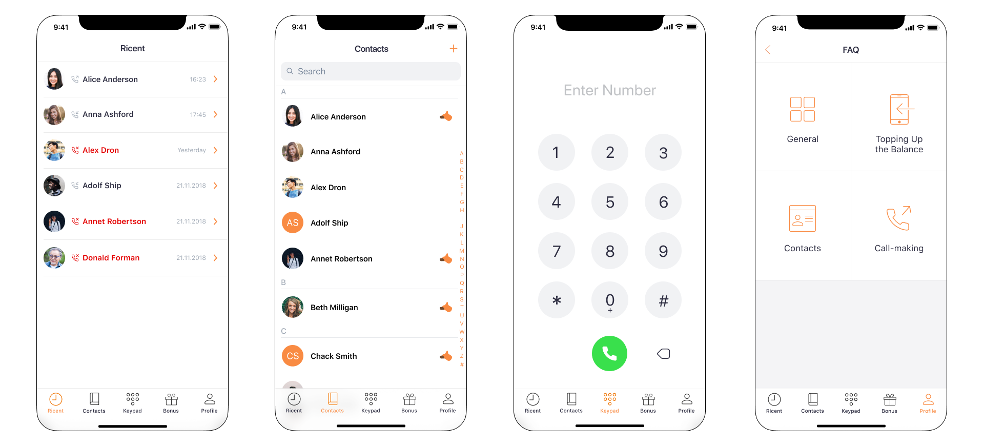
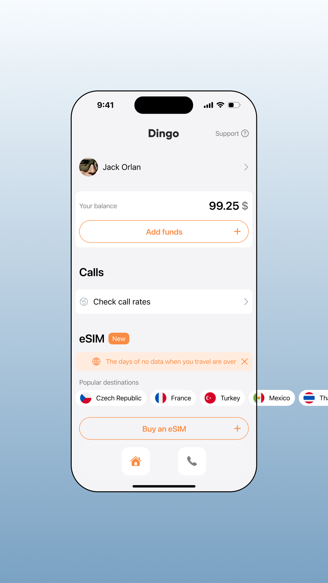
Before the redesign, Dingo was focused on call management: recent calls, contacts, number dialing, and support.

The Challenge
The challenge was to redesign Dingo from a calling-only app into a broader mobile connectivity product.
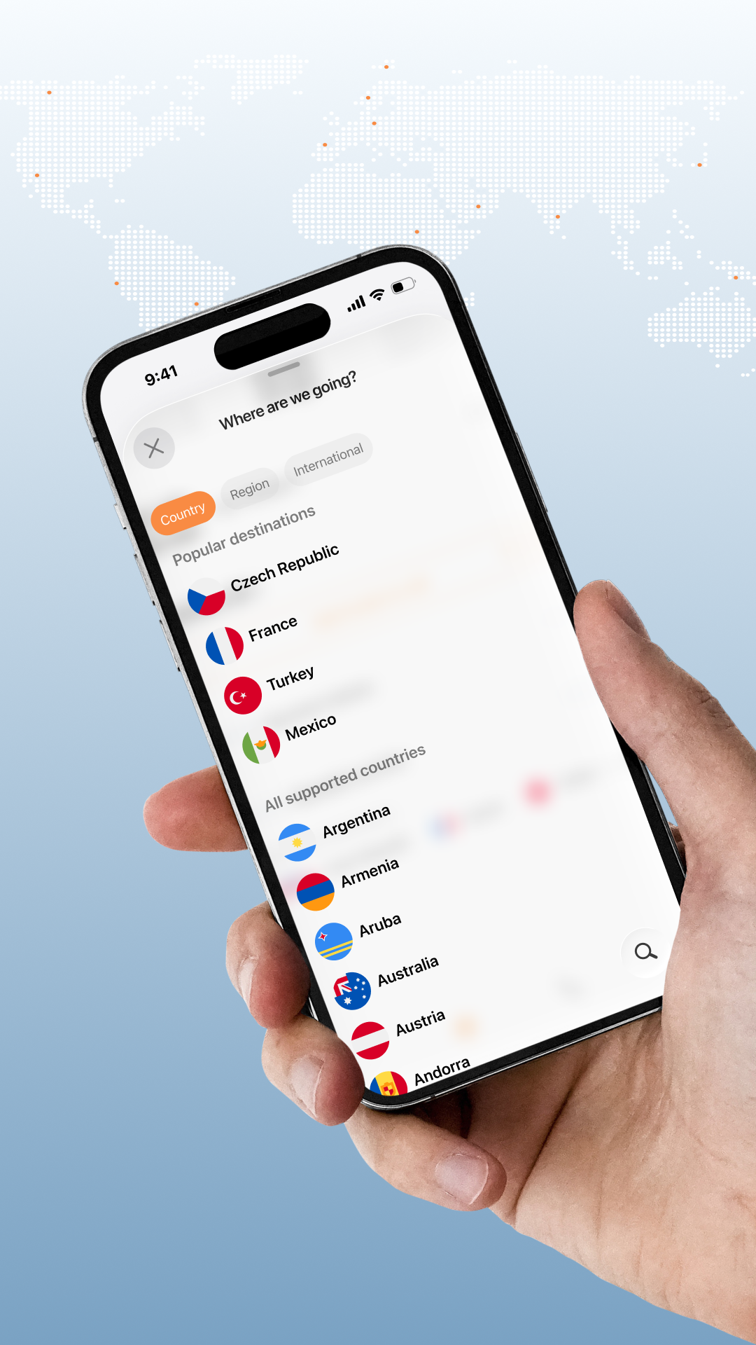
Adding eSIM introduced a new user journey: choosing a destination, comparing plans, purchasing, installing, and activating the service.
The experience had to feel clear, trustworthy, and easy to complete without support — while keeping international calling accessible inside the new product structure.
Adding eSIM introduced a new user journey: choosing a destination, comparing plans, purchasing, installing, and activating the service.
The experience had to feel clear, trustworthy, and easy to complete without support — while keeping international calling accessible inside the new product structure.
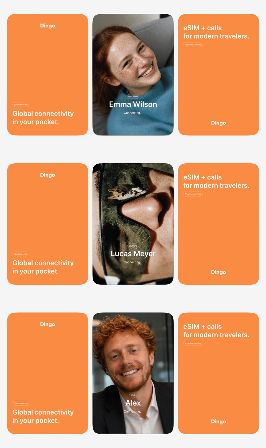
Product audit & discovery
Before redesigning the product, I analyzed the existing mobile app, its calling-focused structure, and the new requirements introduced by eSIM.
The goal was to understand which parts of the old experience could be reused, where the existing structure created limitations, and what new flows were needed to support travel connectivity.
I also reviewed common eSIM purchase and activation patterns to identify the moments where users need the most guidance: destination selection, plan comparison, payment, installation, activation status, and troubleshooting.
The goal was to understand which parts of the old experience could be reused, where the existing structure created limitations, and what new flows were needed to support travel connectivity.
I also reviewed common eSIM purchase and activation patterns to identify the moments where users need the most guidance: destination selection, plan comparison, payment, installation, activation status, and troubleshooting.
Key insight
Users don’t want to manage telecom complexity —
they want to know that they will be connected when they need it
they want to know that they will be connected when they need it
The most fragile part of the experience was not the purchase itself, but the uncertainty around it.
Users needed to understand whether the plan worked in their destination, what would happen after payment, how to install the eSIM, and whether the service was ready to use.
This shaped the product approach: the interface had to guide users step by step, explain important details before purchase, and make service status clear after activation.
Users needed to understand whether the plan worked in their destination, what would happen after payment, how to install the eSIM, and whether the service was ready to use.
This shaped the product approach: the interface had to guide users step by step, explain important details before purchase, and make service status clear after activation.

Redefining the mobile product structure
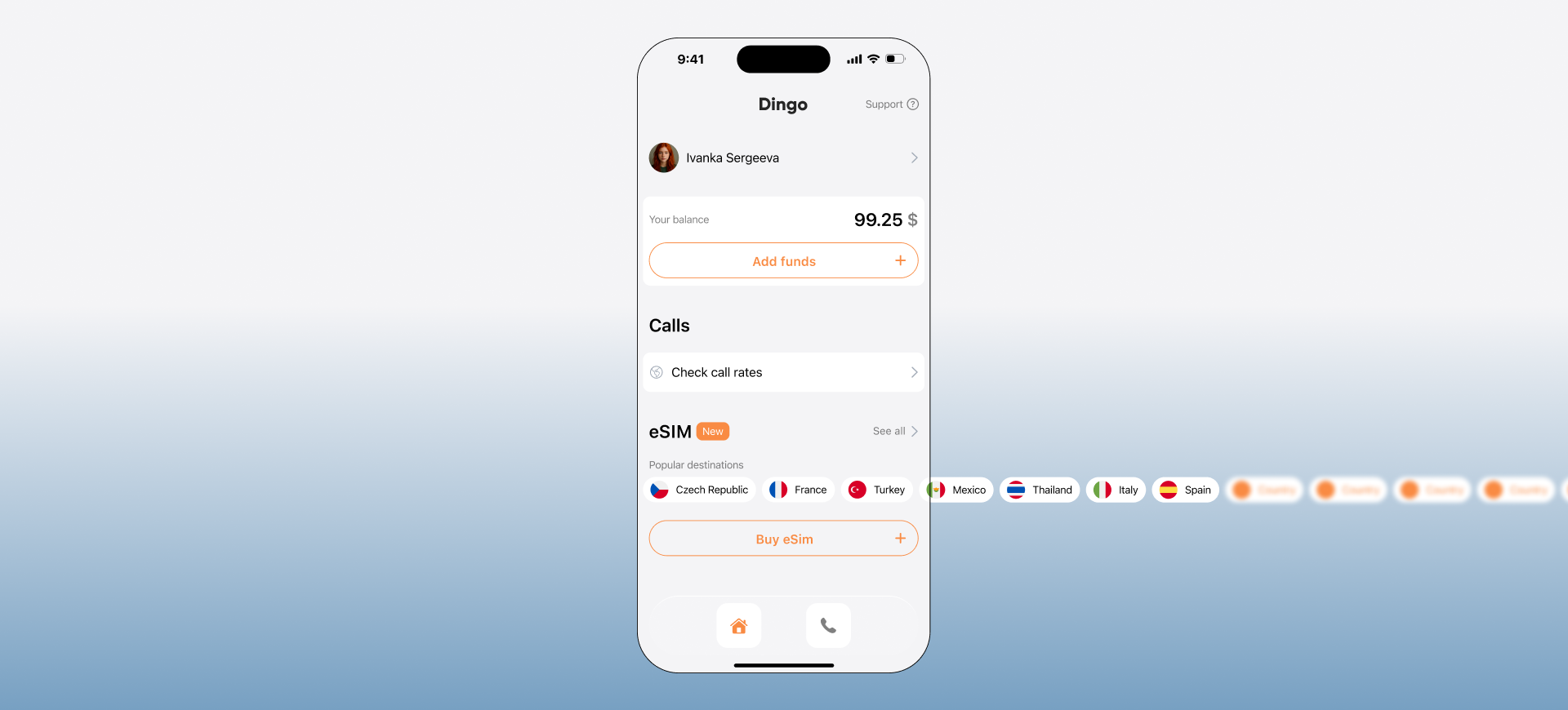
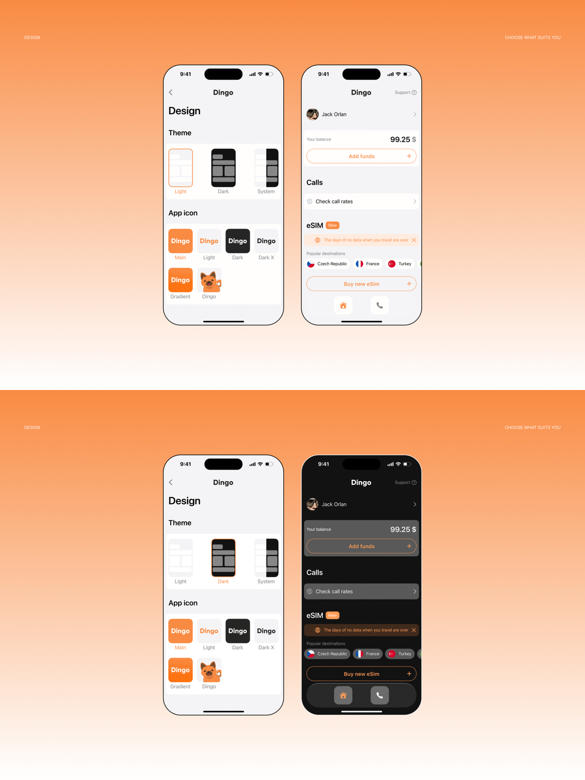
I reworked the mobile app around user intent rather than the old calling-only structure.
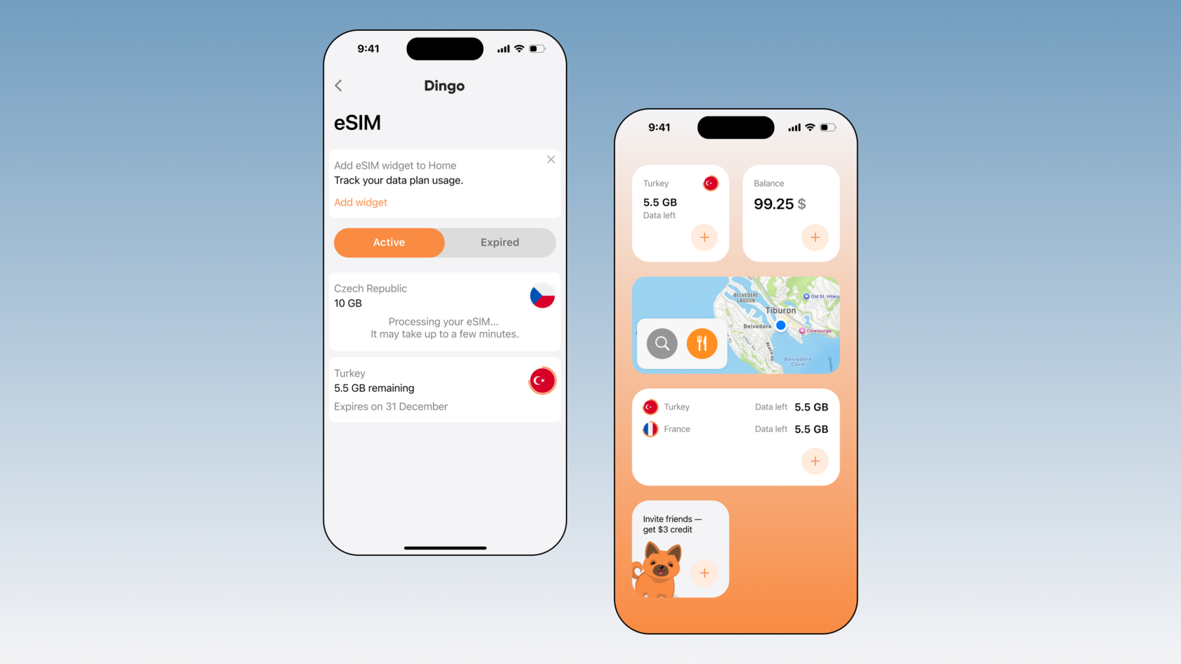
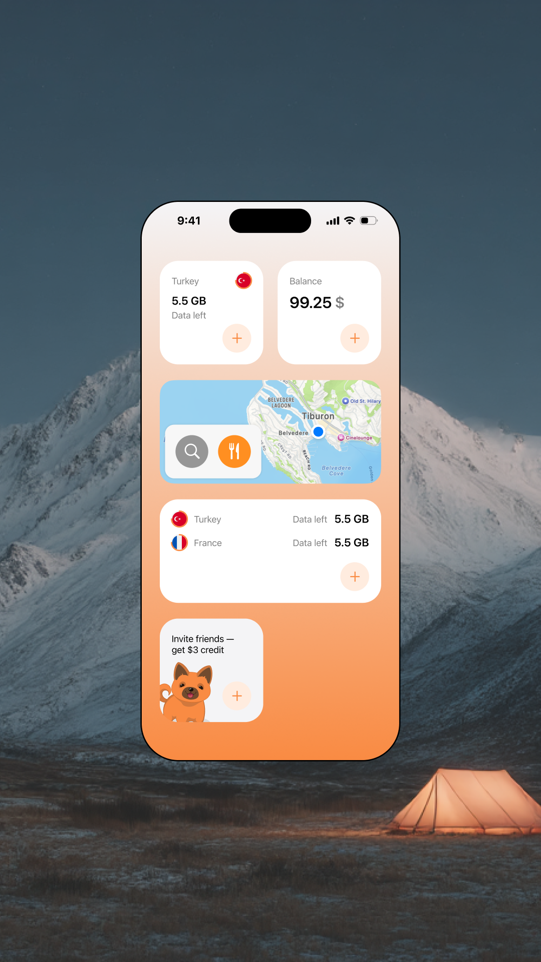
The new structure separated the main needs: getting connected with eSIM, managing active services, checking balance, viewing call rates, and making international calls.
This allowed eSIM and calling to coexist in one product without competing for attention.
The new structure separated the main needs: getting connected with eSIM, managing active services, checking balance, viewing call rates, and making international calls.
This allowed eSIM and calling to coexist in one product without competing for attention.
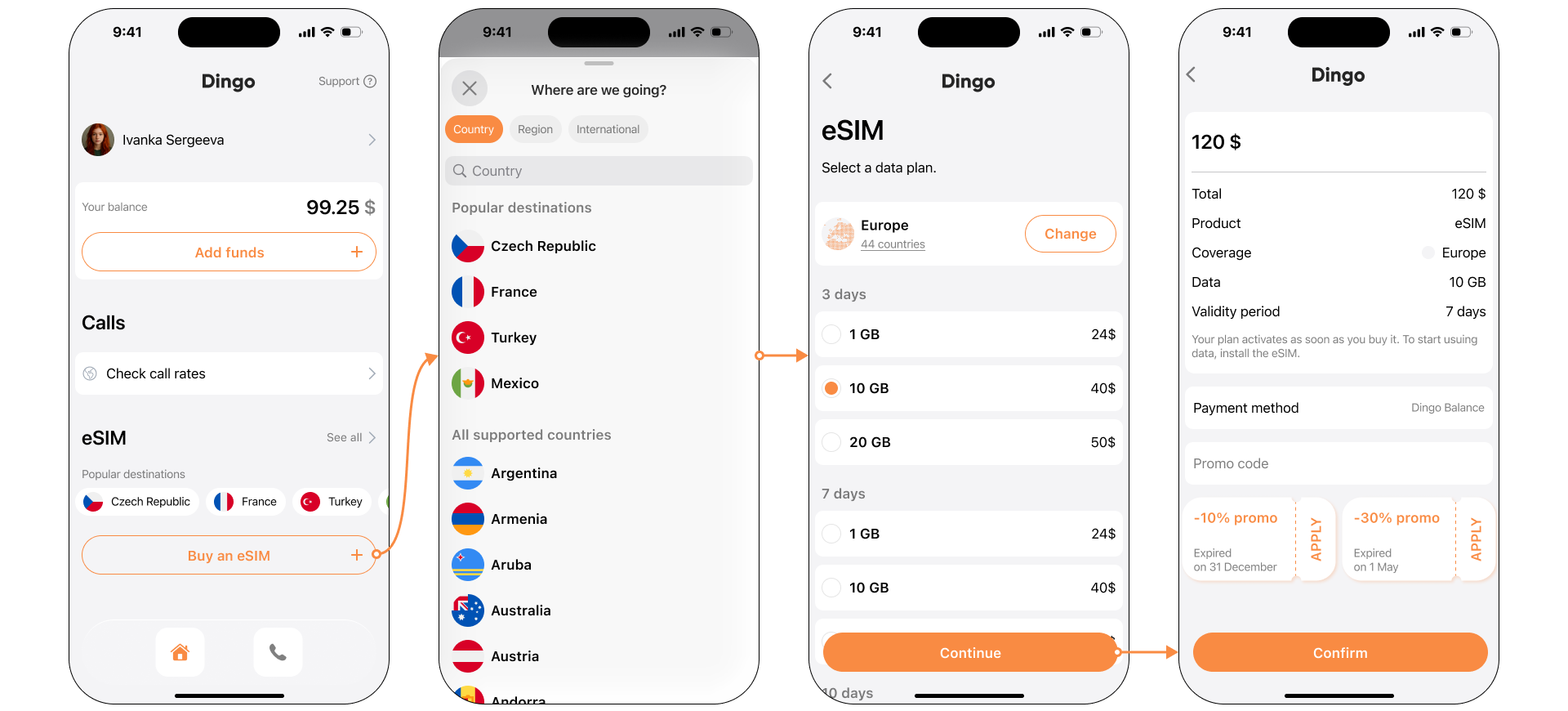
Buying an eSIM
Choose destination → Select plan → Review purchase → Confirm
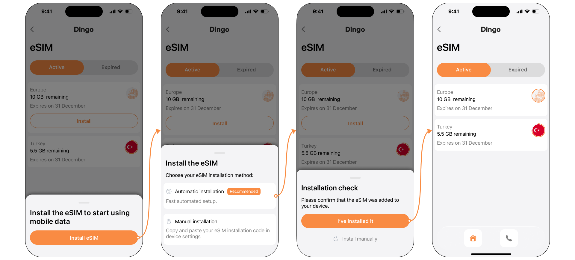
eSIM installation flow
After purchase, the app guides users through installation and makes the eSIM status clear once the service is ready to use.
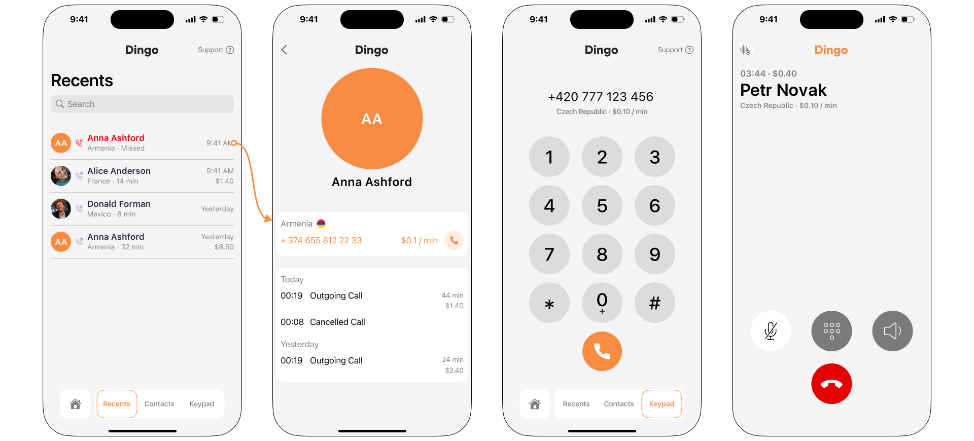
Keeping international calls in the new product structure
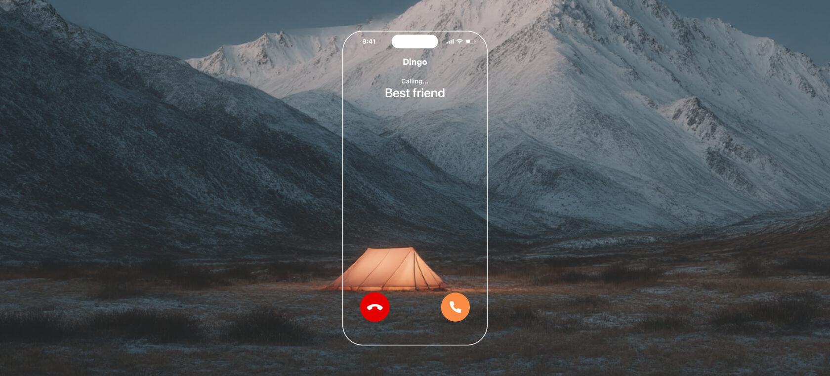
Calling remained part of Dingo, but was redesigned as one of several connectivity scenarios rather than the only main use case.
Selected mobile screens
Impact
Expanded the product model
Dingo evolved from a calling app into a unified product for eSIM and international calling.
Created an end-to-end journey
The new flow connected plan selection, purchase, installation, and activation in one guided experience.
Built for future growth
The navigation was redesigned around user intent, creating a scalable foundation for new connectivity services.


ABOUT
Senior Product Designer based in Prague
6+ years in digital product design
6+ years in digital product design

I lead design from discovery to delivery — turning research, business goals, and technical constraints into clear product systems and scalable user experiences.
My strongest experience is in 0-to-1 products, AI-powered platforms, and complex operational workflows. At SMART FARM, I built the design process from scratch and designed a web and mobile platform used across more than 25 farms.
I work closely with product managers, engineers, and domain experts to make sure design does not only look clear, but helps users make decisions, complete tasks faster, and trust the product.
Creativity has always been part of my life. Outside of work, I paint with oils, enjoy sewing and fashion, and love travelling and discovering new places.
My strongest experience is in 0-to-1 products, AI-powered platforms, and complex operational workflows. At SMART FARM, I built the design process from scratch and designed a web and mobile platform used across more than 25 farms.
I work closely with product managers, engineers, and domain experts to make sure design does not only look clear, but helps users make decisions, complete tasks faster, and trust the product.
Creativity has always been part of my life. Outside of work, I paint with oils, enjoy sewing and fashion, and love travelling and discovering new places.
Experience
SMART FARM
Senior Product Designer
2021 — Present
2021 — Present
Buyex
UX/UI Designer
2019 — 2021
2019 — 2021
Freelance
Graphic & Brand Designer
2017 — 2019
2017 — 2019
Education
Brand Management
Bachelor’s degree,
State University of Management
2017-2021
State University of Management
2017-2021